Summer-Proof Your Home: The Best Cool Paint Colors for a Refreshing Interior
- Sayanika Das
- Apr 10, 2025
- 6 min read

Updated: Apr 22, 2025
Are you not a summer lover, or are you? Summer brings its own seasonal flavor, From the sweetness of fruits to the harshness of scorching heat. Summers are vibrant, energetic, sweaty, and cluttered, too. We all associate summer with summer vacation, where we play outside, lulled by the sun. Ice cream, coconut water, red faces, and sweaty clothes are the faces of summer. We can't change the weather, so it becomes a necessity that we make our home interiors suitable for summer. Now that we have your attention, let's talk facts about cool colors for the home interior.
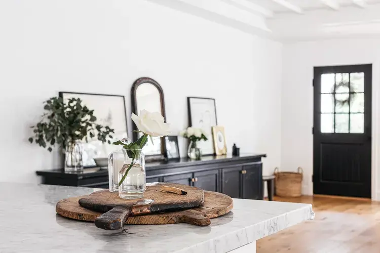
As temperatures rise and the sun becomes scorching, our homes start becoming warmer—sometimes uncomfortably hot. Most of the time, we rely on fans and air conditioners to cool the air, but there’s another powerful (and often overlooked) way to beat the summer heat: your home’s color palette.
During the summer, dark color tones in the interior wall can feel heavy, absorbing heat and making rooms feel smaller and warmer. In contrast, cool paint colors like soft blues, gentle greens, and crisp whites can instantly make a room feel more open, airy, and calming. A seasonal refresh with the right hues can transform your interiors into a serene retreat from the sweltering outdoors.
In this article, we’ll explore the best cool colors for home interiors during summer, how they affect mood and comfort, and tips to incorporate them into your living space.

Why Color choice matters in summer
Did you ever walk into a home and feel cooler without AC? That's probably one of the magic of colors. Color is not only a design choice; it is also an emotional need.
Our eyes perceive color in terms of temperature, comfort, and mood. The brown that would make you feel cozy in winter will heat the room in summer. Not only as a perception, but scientifically also, lighter colors reflect sunlight, whereas dark colors absorb it. Now, if your room has a dark color, it will definitely absorb the peak sunlight at noon; no wonder your home feels like a sauna.
But here’s the thing: switching to cool colors doesn’t mean your space has to feel cold or clinical. It’s all about balance. The right soft tones can still feel inviting—they just bring that breath-of-fresh-air feeling your home is probably craving this time of year. So, let’s jump into some of these cool shades, which are perfect for summer living.
Best Cool Paint Colors for Home Interiors in Summer
When the heat is on, your walls and decor can either work with you or against you. Let’s explore some of the most calming, crisp, and effortlessly best colors for summer interiors that can make your space feel like a summer breeze.
1. The Placid Sky Blue

Ah, look at this blue color; it resembles the color of the calm sea and the cloudless sky. It’s a reflection of memories full of summer.
Sky blue instantly opens up a space, making it feel airy and peaceful. It’s perfect for bedrooms, reading corners, or any room where you want to mentally check out and float away for a while. Pair it with white or sandy beige accents for that effortless coastal vibe—even if your home is miles away from the ocean.
Pro Tip: Use matte or satin finishes for a softer, more natural look. Think sky-blue walls, sheer white curtains, and rattan furniture = chef’s kiss.
2. Misty Mint Green

Mint is like the cool cousin of green—light, playful, and oh-so-refreshing. It's a proper summer home color palette.
This shade brings in the freshness of spring gardens and morning dew, without overpowering the room. It works wonders in kitchens and bathrooms, where you want things to feel crisp and clean. But honestly? Mint is versatile enough to brighten up living rooms, too, especially when paired with pale woods or creamy whites.
Pro Tip: Layer in some leafy green plants to play up the natural, spa-like feel.
3. Lavender Haze

Looking for something a bit dreamy? Lavender to the rescue.
Soft lavender leans more cool than warm, and when used right, it can bring a calming, almost ethereal touch to a space. It’s great for bedrooms, meditative corners, or even powder rooms where you want a gentle burst of personality. And yes—it pairs beautifully with silver, light grey, and soft pinks.
Pro Tip: Try a dusty or muted lavender rather than something too bright—it gives a grown-up, romantic twist without being overly sweet.
4. Cool Clay Gray

Not all cool colors have to be “colorful.” Enter: cool gray.
This shade is clean, modern, and quietly sophisticated. Unlike warm grays with brown undertones, a cooler clay gray has blue or green undertones, making it perfect for dialing down the heat in any space. It plays well with both bold and soft colors, making it a designer’s dream.
Pro Tip: Layer textures to keep it from feeling too flat—think linen cushions, woven rugs, or matte ceramics.
5. Crisp White with Cool Undertones
White is classic, but not all whites are created equal
For summer, skip the creamy or yellowish tones and opt for a crisp white with cool (blue or gray) undertones. It reflects light beautifully and makes even the tiniest spaces feel bright and open. It’s a perfect base to mix in cool-toned furniture, accents, and art.
Pro Tip: This is your blank canvas. Add pops of mint, sea foam, or sky blue to the decor to make it sing.
6. Seafoam Green

If mint is playful, seafoam is more of its softer, serene sister.
This delicate blend of green and blue feels like a gentle wave washing over your room. It’s especially lovely in spaces where you want a bit of whimsy without going too bold—think guest rooms, nurseries, or even a calming entryway.
Pro Tip: Combine with natural textures—think jute rugs, driftwood pieces, and pale fabrics—for a beachy, effortless look.
7. Pale Aqua or Ice Blue

Aqua is like a dip in a cold pool on a hot day—instantly refreshing.
This color works well in spaces where you get good sunlight during the day as it brings a cooling balance to all that warmth pouring in through the windows. It has enough character to stand on its own but is soft enough not to overwhelm. Great for kitchens, dining nooks, or creative spaces.
Pro Tip: Pair with white trim, chrome fixtures, and glass for a crisp, light-filled vibe.
Mistakes to Avoid with Cool Colors
Any design decision is critical. Choosing cool colors doesn't mean, any shade would work—it’s all about balance. A little too much cool, and suddenly your cozy space feels more like a hospital waiting room. Let’s make sure that doesn’t happen.
1. Going Too Cold and Sterile
Cool colors are calming, yes—but if your entire room is drenched in icy blues or gray's with no warmth or texture, it can feel impersonal or even a bit chilly. Remember, we’re going for refreshing, not freezing. Always balance cool tones with warmer accents like wood, brass, or earthy textiles.
2. Ignoring Natural Light
Lighting changes how a color looks throughout the day. A soft mint in your Pinterest board might look pale green in the morning sun but turn almost white by evening—or worse, dull and flat. Always test paint swatches in different corners of the room and at different times of the day before committing.
3. Forgetting About Undertones
Not all cool colors are created equal. Some blues have green undertones, some purples have red hints, and not every white is truly white. Mixing clashing undertones can make a space feel “off” without knowing exactly why. So, when choosing multiple cool tones, try to stay within the same family of undertones for harmony.
4. Overlooking Texture
Cool tones thrive when paired with texture. Without it, a room can fall flat. Think breezy linen curtains, woven baskets, lightly distressed wood, or layered cushions. These elements warm up a cool palette while still keeping things light and summary.
5. Playing It Too Safe
Yes, cool colors are calming—but that doesn’t mean you have to stick to boring. Don’t be afraid to play with bold cool accents—a rich teal cushion, a dramatic slate-blue wall, or a fun mint armchair. Cool colors can still have personality!
Let Your Home Breathe This Summer- The End!

Some may hate summer, but like any other season, it also brings its fruits. Sunlight dancing on the floor, the half-opened window, to let in the breeze… but, uh-oh, hot air! However, with our help from this article, your home will breathe light—as lightly as your summer's favorite cotton tee. Cool colors can help your space mirror that vibe. They refresh the senses, soften the heat, and bring a sense of ease that just feels right when the days get longer.
It's all about a long exhale at the end of a hot, sticky day, that your home can make you feel. So, choose shades that speak to you, which makes you feel relaxed, and invites you to stay a little longer in your space.
Because the coolest home this summer? It’s the one that lets you be comfortable, calm, and completely yourself.


Comments